British_Gas-stevewhapshott-8.jpg

British Gas

A new visual identity for the UK's biggest energy provider.


Challenge

Create a fresh new identity to reflect the new brand proposition ‘Smooth running’, and build trust with customers.


Solution

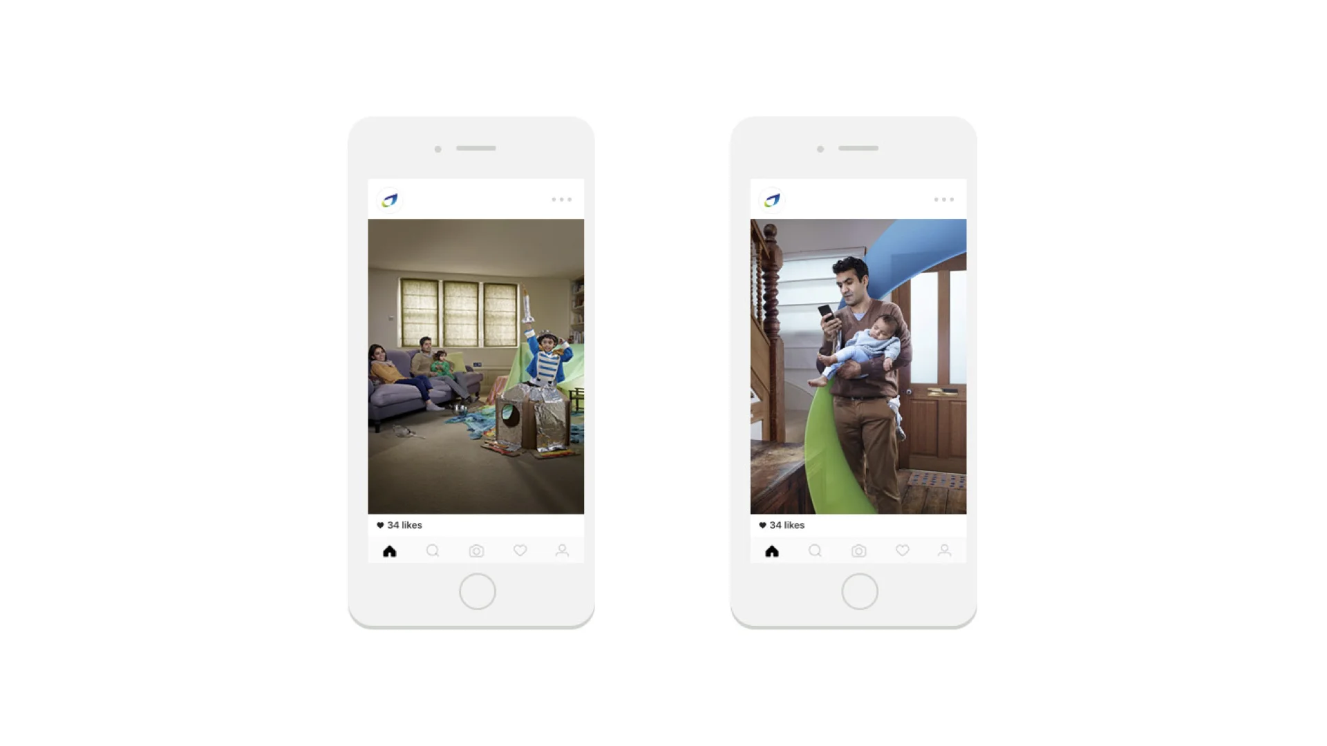
Real, friendly and simply human.

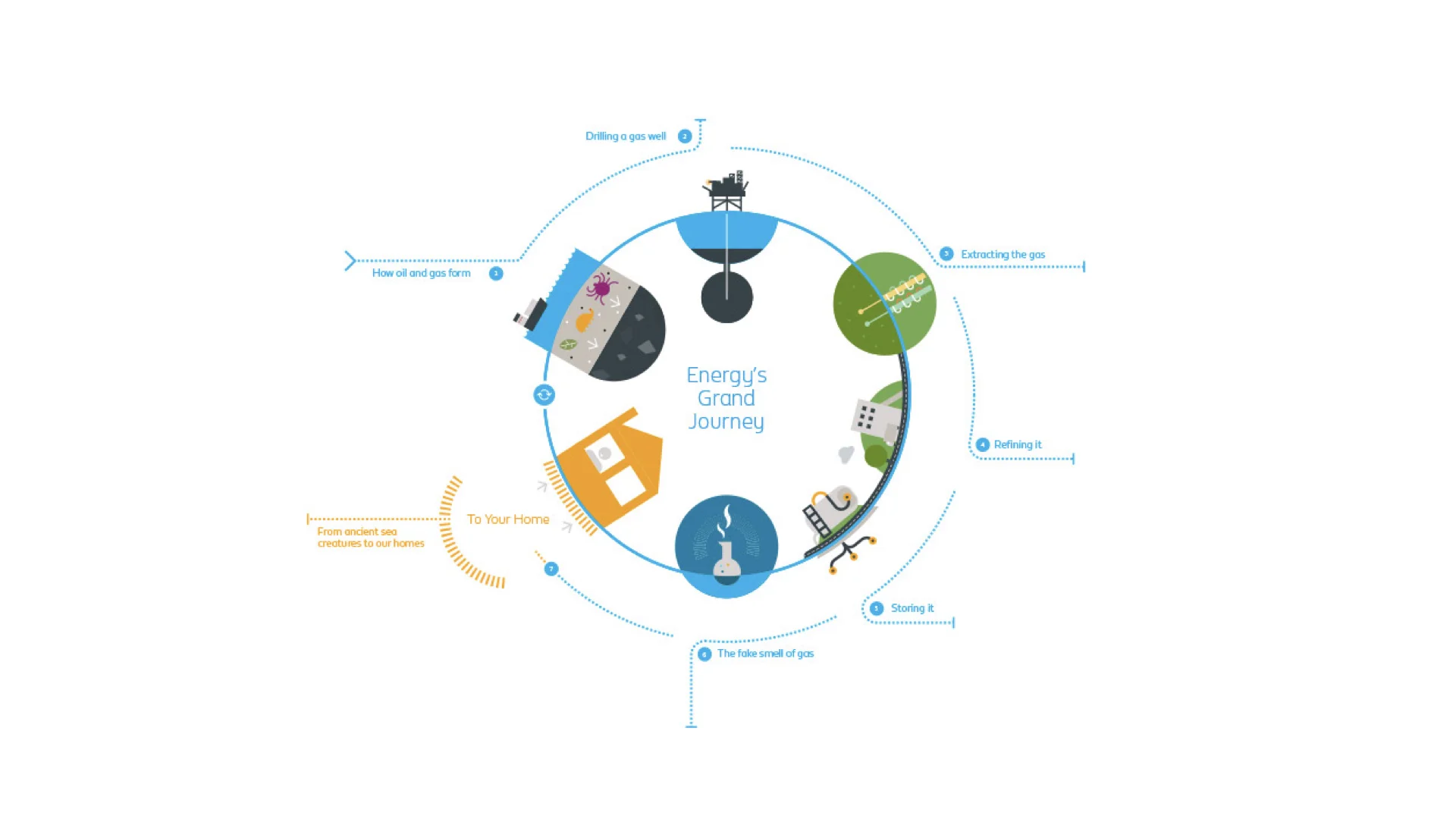
A brand language that expresses a clear understanding and care for real people and real lives. New brand values were created and introduced to ground everything in being in-tune, down to earth, and pioneering for customers. This carried through into new graphic elements, colour palettes, iconography, a fresh new typeface, infographics and photography.


British_Gas-stevewhapshott-16.png
Stories from the home

Stories from the home

Stories told from customer perspective's in modern, multi-cultural Britain. The fresh new imagery captures positive, human moments in an enhanced, emotive style.

British_Gas-stevewhapshott-6.jpg
British_Gas-stevewhapshott-7.jpg
British_Gas-stevewhapshott-8.jpg
British_Gas-stevewhapshott-17.png
Capturing energy in surreal spaces

Capturing energy in surreal spaces

Product photography inspired by textures, colours and lighting from the warmth of the home.

British_Gas-stevewhapshott-2.jpg
British_Gas-stevewhapshott-3.jpg
British_Gas-stevewhapshott-4.jpg
BG Flame

BG Flame

The brand new custom typeface was essential to ensure the voice genuinely connected with the customer. Billing and account documentation is a key channel for the brand and one that needed a friendlier approach. Working closely with the team at Fontsmith we created a typeface that addressed this in a series of weights; BG Flame. 

British_Gas-stevewhapshott-19.jpeg
British_Gas-stevewhapshott-24.jpeg
British_Gas-stevewhapshott-23.jpeg
British_Gas-stevewhapshott-22.jpeg
British_Gas-stevewhapshott-21.jpeg